Colour Palette

Phi Colours

#EC3225

rgba(236, 50, 37, 1)

hsl(4, 84%, 54%)

phi-base-red-500  
#FAB518

rgba(250, 181, 24, 1)

hsl(42, 96%, 54%)

phi-base-yellow-500  
#098BCB

rgba(9, 139, 203, 1)

hsl(200, 92%, 42%)

phi-base-blue-500  

Primary Base Colour Palette

Primary, shades and tints are used primarily for all data visualisation and also for dark themes.

#BCE7FC

rgba(188, 231, 252, 1)

hsla(200, 91%, 86%, 1)

#8DD6F9

rgba(141, 214, 249, 1)

hsla(199, 90%, 76%, 1)

#5EC5F7

rgba(94, 197, 247, 1)

hsla(200, 91%, 67%, 1)

#28B1F5

rgba(40, 177, 245, 1)

hsla(200, 91%, 56%, 1)

#098BCB

rgba(9, 139, 203, 1)

hsla(200, 92%, 42%, 1)

#066B9C

rgba(6, 107, 156, 1)

hsla(200, 93%, 32%, 1)

Primary Base Colour Palette

Primary, shades and tints are used primarily for all data visualisation and also for dark themes.

#FDE1A3
#FCD374
#FBC446
#FAB518

Secondary Data Visualisation Palette

Tints to be used in Data Viz and dark themes. Absolute Red to be used as a Semantic colour.

#F9BBB6
#F48D86
#F06055
#EC3225

Categorical Colour Palette

#28B1F5
#FBC446
#F48D86
#F1B47D
#B9C081
#8F8F8F

Semantic Colour Palette

#EC3225
#99E9BA
#66DE98
#33D375
#00C853

Neutral Colour Palette

#FCFCFC
#F9F9F9
#F2F2F2
#DCDCDC
#C4C4C4
#ACACAC
#8F8F8F
#6B6B6B
#525252
#393939
#212121

Grid and Layout

Grids Cols

01
02
03
04
05
06
07
08
09
10
11
12
13
14
15
16

Grids Rows

01
02
03
04
05
06
07
08
09
10
11
12
13
14
15
16

Typography

Typeface

Open Sans

Aa

Regular

Aa

Semi bold

Aa

Bold

LARGE HEADING B

Open Sans - Bold

Font Size: 42px / Line height: 60px

The quick brown fox jumped over the lazy dog

LARGE HEADING SB

Open Sans - Semi Bold

Font Size: 42px / Line height: 60px

The quick brown fox jumped over the lazy dog

HEADING B

Open Sans - Bold

Font Size: 26px / Line height: 36px

The quick brown fox jumped over the lazy dog

HEADING SB

Open Sans - Semi Bold

Font Size: 26px / Line height: 36px

The quick brown fox jumped over the lazy dog

HEADING

Open Sans - Regular

Font Size: 26px / Line height: 36px

The quick brown fox jumped over the lazy dog

SUB HEADING B

Open Sans - Bold

Font Size: 20px / Line height: 30px

Alice was beginning to get very tired of sitting by her sister on the bank, and of having nothing to do once or twice she had peeped into the book her sister was reading.

SUB HEADING SB

Open Sans - Bold

Font Size: 20px / Line height: 30px

Alice was beginning to get very tired of sitting by her sister on the bank, and of having nothing to do once or twice she had peeped into the book her sister was reading.

SUB HEADING

Open Sans - Regular

Font Size: 20px / Line height: 30px

Alice was beginning to get very tired of sitting by her sister on the bank, and of having nothing to do once or twice she had peeped into the book her sister was reading.

SUB HEADING SB

Open Sans - Semi Bold

Font Size: 18px / Line height: 26px

Alice was beginning to get very tired of sitting by her sister on the bank, and of having nothing to do once or twice she had peeped into the book her sister was reading.

SUB HEADING

Open Sans - Regular

Font Size: 18px / Line height: 26px

Alice was beginning to get very tired of sitting by her sister on the bank, and of having nothing to do once or twice she had peeped into the book her sister was reading.

BODY B

Open Sans - Bold

Font Size: 16px / Line height: 24px

Alice was beginning to get very tired of sitting by her sister on the bank, and of having nothing to do once or twice she had peeped into the book her sister was reading.

BODY

Open Sans - Regular

Font Size: 16px / Line height: 24px

Alice was beginning to get very tired of sitting by her sister on the bank, and of having nothing to do once or twice she had peeped into the book her sister was reading.

REGULAR B

Open Sans - Bold

Font Size: 14px / Line height: 20px

Alice was beginning to get very tired of sitting by her sister on the bank, and of having nothing to do once or twice she had peeped into the book her sister was reading.

REGULAR SB

Open Sans - Semi Bold

Font Size: 14px / Line height: 20px

Alice was beginning to get very tired of sitting by her sister on the bank, and of having nothing to do once or twice she had peeped into the book her sister was reading.

REGULAR

Open Sans - Regular

Font Size: 14px / Line height: 20px

Alice was beginning to get very tired of sitting by her sister on the bank, and of having nothing to do once or twice she had peeped into the book her sister was reading.

SMALL

Open Sans - Small

Font Size: 12px / Line height: 16px

Alice was beginning to get very tired of sitting by her sister on the bank, and of having nothing to do once or twice she had peeped into the book her sister was reading.

UI Controls

Buttons

Default

Large Normal

Large Disable

Small Normal

Small Disable

Primary

Secondary

Link

Danger

Warning

Success

Checkbox

Radio Button

Input Fields

Text Area

Accordions

Accordion #1

Lorem ipsum dolor sit amet, consectetur adipiscing elit. Sed sed fermentum quam. Suspendisse malesuada ex nec lectus luctus varius. Vestibulum egestas elit velit, sed mollis odio pulvinar sit amet. Quisque elementum leo at arcu ultricies suscipit. Maecenas viverra, orci vitae faucibus suscipit, mauris massa rhoncus augue, ac interdum ipsum lacus vitae augue.Aenean feugiat, diam non tempor tempus, erat tellus aliquam ante, vitae faucibus felis mauris et lectus. Duis hendrerit vehicula nunc in molestie.

Accordion #2

Lorem ipsum dolor sit amet, consectetur adipiscing elit. Sed sed fermentum quam. Suspendisse malesuada ex nec lectus luctus varius. Vestibulum egestas elit velit, sed mollis odio pulvinar sit amet. Quisque elementum leo at arcu ultricies suscipit. Maecenas viverra, orci vitae faucibus suscipit, mauris massa rhoncus augue, ac interdum ipsum lacus vitae augue.Aenean feugiat, diam non tempor tempus, erat tellus aliquam ante, vitae faucibus felis mauris et lectus. Duis hendrerit vehicula nunc in molestie.

Tablets

Default Tablet Default Tablet Primary Tablet Primary Tablet Warning Tablet Warning Tablet Danger Tablet Danger Tablet Success Tablet Success Tablet

Badges

20 20+ 20+ 20+ 20+

Message

This is a short message.

This is a short message.

This is a short message.

This is a short message.

This is a long message of about 2-3 lines maximum

This is a long message of about 2-3 lines maximum

This is a long message of about 2-3 lines maximum

This is a long message of about 2-3 lines maximum.

Toggle

Table:

Choice 1

Choice 2

Label

Label

Tooltip

Sliders

Single Slider
Multi Slider

UI Components

Title

Title
Title
A suitable description for the table in a liner.
Title
Title
A suitable description for the table in a liner.

Recommendation Card

Title

Lorem ipsum, dolor sit amet consectetur adipisicing elit. Provident repellat ea non dolorem recusandae, optio natus molestiae quis voluptates, fugiat dolorum! Mollitia eaque beatae omnis consequatur necessitatibus ipsam repellat. Voluptatibus?

Dismiss
Title

Lorem ipsum, dolor sit amet consectetur adipisicing elit. Provident repellat ea non dolorem recusandae, optio natus molestiae quis voluptates, fugiat dolorum! Mollitia eaque beatae omnis consequatur necessitatibus ipsam repellat. Voluptatibus?

Hailie Saber at 1:30 PM on 17 September 2021

3

Insight Cards

Title
One or two lines of description here to tell about the insight.

			
Title
One or two lines of description here to tell about the insight.

			
Title
One or two lines of description here to tell about the insight.

Hailie Saber at 1:30 PM on 17 September 2021


Title
One or two lines of description here to tell about the insight.


Card

Title

					
Title

				
Title
Lorem ipsum, dolor sit amet consectetur adipisicing elit. Quasi ipsam quo dolorum aspernatur quod dicta velit accusamus praesentium minima, odio temporibus nulla a aperiam illum at adipisci nam vitae tenetur.

				
Title
Lorem ipsum, dolor sit amet consectetur adipisicing elit. Quasi ipsam quo dolorum aspernatur quod dicta velit accusamus praesentium minima, odio temporibus nulla a aperiam illum at adipisci nam vitae tenetur.

			
Title
Lorem ipsum, dolor sit amet consectetur adipisicing elit. Quasi ipsam quo dolorum aspernatur quod dicta velit accusamus praesentium minima, odio temporibus nulla a aperiam illum at adipisci nam vitae tenetur.

			
Title
Lorem ipsum, dolor sit amet consectetur adipisicing elit. Quasi ipsam quo dolorum aspernatur quod dicta velit accusamus praesentium minima, odio temporibus nulla a aperiam illum at adipisci nam vitae tenetur.

			
Bar Chart

			
Bar Chart


Comments

Robert Downey
1:30pm | 20 April 2021
We can do this for you, but give us the updated info. on LA.
Robert Downey
1:30pm | 20 April 2021
We can do this for you, but give us the updated info. on LA.
Reply to

KPI Cards

Title
A suitable description
$1000.0 M
100.0%

				
Title
A suitable description
$1000.0 M
100.0%
Vs Mar 2020
100.0%
Vs Mar 2019
100.0%
Vs Mar 2019

					
Title
A suitable description
$1000.0 M
100.0%
Vs Mar 2020
100.0%
Vs Mar 2019

				
Title
A suitable description
$100.0 M
100.0%
Vs Mar 2020


Datepickers

Date Label
Label
Label
Label
Error Message
Label

Filters

Horizontal Filter Bar
Label

Title

Side Menu Filter Bar
Label

Title

Side Menu Filter Bar

Title

Title

Floating Button

Title

Charts

Bar Chart

			
Waterfall Chart

			
Comparison Bar Chart

			
Stacked Bar Chart

				
Stacked Bar Chart (PTW)

				
Horizontal Bar Chart

				
Line Chart

			
Area Chart

		
Pie Chart

		
Donut Chart

	
Speedometer Chart

		
Progress Chart

		
Bubble Chart

		
Heatmap Chart

				
Treemap Chart


Table Card

Country Turnover Sales Margin Sales Margin Sales Margin
Canada $2,445,662 36% Placeholder
United Arab Emirates $2,445,662 36% Placeholder

			
Bar Trend Chart

A suitable description for the table in a liner.


Bar Trend Chart

A suitable description for the table in a liner.


Bar Trend Chart

A suitable description for the table in a liner.


Bar Trend Chart

A suitable description for the table in a liner.


Striped Table

Country Turnover Sales Margin
Canada $2,445,662 36%
United Arab Emirates $2,445,662 36%


Extended Striped Table

Country Turnover Sales Margin Sales Margin Action
Canada $2,445,662 55%
434.8M
United Arab Emirates $3,445,662 75%
434.8M
India $4,445,662 85%
434.8M
Japan $7,445,662 15%
434.8M
Canada $2,445,662 55%
434.8M


Layouts

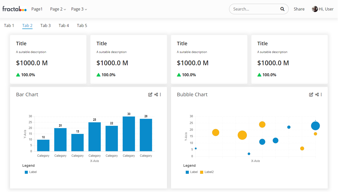
Default Layout

The Default Phi Design Template Layout with Top Navigation, Content Switching, KPI Cards, Bubble and Bar charts on the Home view


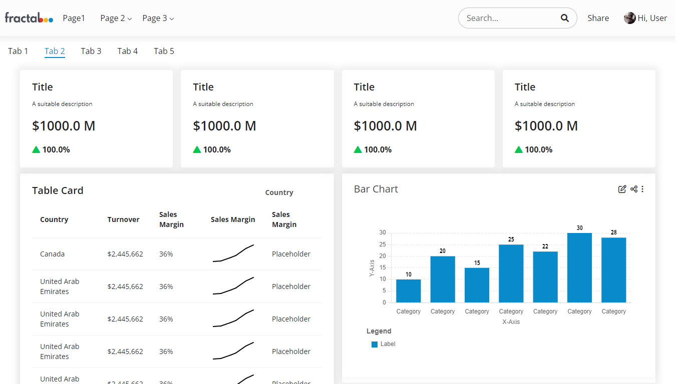
Detailed Layout

The Detailed Layout containing all the components of the default layout with an added table


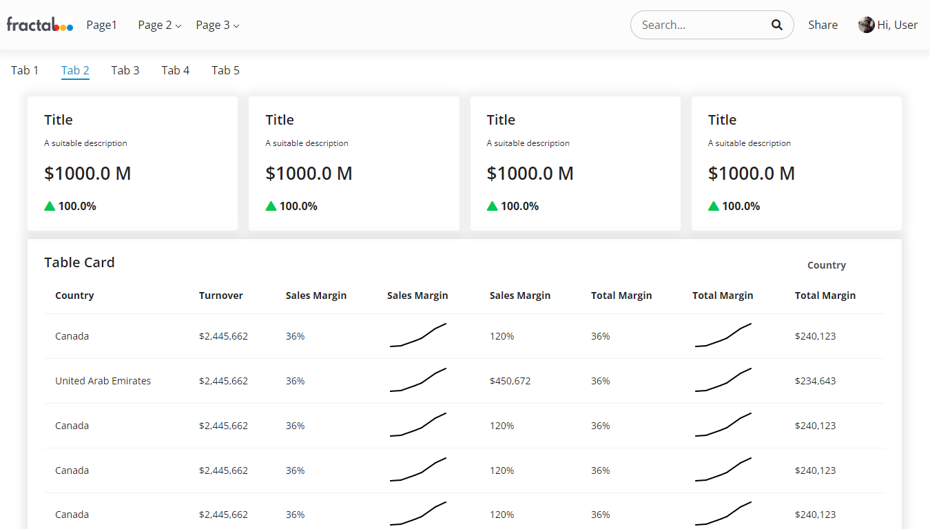
Alternative Detailed Layout

The Detailed Layout with more focus on information deep-dive across multiple levels of visibility through tables